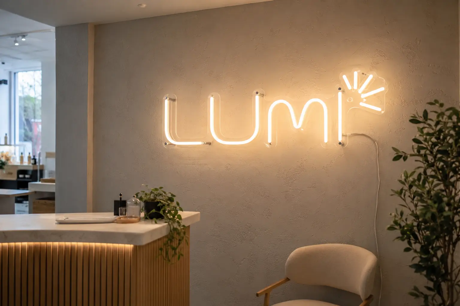
Designed from real brand artwork
A good logo neon sign is not simply a logo traced with light. Fine details, tight counters and very thin strokes may need to be simplified so the illuminated version stays readable from the intended viewing distance.
We review vector artwork, identify the essential shapes and prepare a visual proof showing line weight, backing shape and scale. The goal is a buildable interpretation that still feels unmistakably yours.
- Vector artwork review
- Line-weight optimization
- Brand-colour planning
- Scale and wall mockup
Choose the right construction
Clear cut-to-shape acrylic gives the light a floating appearance, while printed or coloured backing can carry details that cannot be formed in LED neon. Layered acrylic can combine illuminated and non-illuminated parts of a logo.
For Ottawa offices, salons, clinics and retail interiors, we also plan standoff placement and power routing so the installation looks intentional rather than temporary.
What affects the quote
Overall dimensions, total illuminated line length, number of colours, backing complexity and installation access all affect cost. A compact single-colour logo is generally simpler than a large multi-part mark with several colours.
Send the logo file, a wall photo and approximate available dimensions. Signartiv can then recommend a practical size and prepare a project-specific quote.